Sogand Safari
Rebranding is the strategic process by which a company reassesses its marketing approach by implementing new elements, such as a new name, logo, or design. The primary goal is to create a new and distinct identity in consumers’ minds.
Rebranding is like renovating an old house. A fresh coat of paint, new floors, and redecorated rooms give it a new look. But rebranding involves more than just changing outside colors and signs.
A brand is not just the sign or colors. It’s the whole experience people have with the product or service. When that experience is out of date, rebranding lets the company start over. They can build a new identity that fits where they want to go.
This article will discuss different types of rebranding companies do, the typical steps taken in a rebranding process, common reasons why companies rebrand, and real-world examples of rebranding efforts that succeeded, as well as some that failed.
A Short Definition: What is Rebranding?
According to Alina Wheeler, a well-known author and great brand consultant:
“Rebranding is not just about vibrant aesthetics or overhauling a logo. It can represent a fundamental recalibration of a company’s mission, merging what it stands for today with what it aims to be tomorrow. ”(From Designing Brand Identity)
Rebranding Types
There are a few different ways they can choose to change their brand. Some changes are small, while others are complete remakes. Here are the three main types:
Brand Refresh
The most basic kind of rebranding is a brand refresh. It’s a simple upgrade to modernize and re-energize an existing brand identity for companies that are currently doing well but want to keep current with an updated look and vibe.
the core brand name, logo, and overall visual identity remain the same. However, small adjustments may be made to elements like, color palette, fonts, image styles, and messaging to give it a more fresh feel. The goal is to improve the brand experience while maintaining the current brand equity and familiarity that has been earned over time. It is an evolution, not a revolution.
Brand Reboot
Taking it a step further is called a “brand reboot” which involves more significant changes and a partial overhaul of key branding elements like logos, taglines, and visuals across marketing materials. However, the core brand name and positioning remain intact.
Companies may go for a reboot when they’ve expanded their offerings, targeted new audiences, or evolved their brand vision over time. A reboot allows them to realign the outward brand expression with where the business stands today while leveraging existing brand awareness.
Full Rebrand
A “full rebrand” is the most dramatic form of rebranding. It’s a comprehensive overhaul that transforms every aspect of the brand identity, expression, and experience internally and externally. We’re talking about a total revamp, including a new company/brand name, logos, visuals, messaging, brand voice and personality, and brand strategy—you name it—built fully from the ground up.
A full rebranding is necessary when there is a significant change in corporate strategy, new ownership, or the previous brand no longer works. It offers the possibility to create a whole new image and reconnect with the audience.
Since it’s launching a new brand identity, expect extensive upfront research, brand strategy, creative development, and a meticulously executed rollout integrating the changes across the board.
No matter which rebranding approach, the ultimate goal is an updated, refined brand identity aligned with the company’s evolution that truly resonates with its audiences. The scale just depends on the specific situation and objectives.
“A brand for a company is like a reputation for a person. You earn reputation by trying to do hard things well.” Jeff Bezos
Reasons for Rebranding
Companies rebrand for various reasons – changing products/services, targeting new customers, or updating an outdated look. Here are some of the biggest motivations that typically drive a rebranding:
New Owner
In the case of a company acquisition or merger, the acquiring parent company often initiates a rebranding of the newly acquired business, which typically involves adopting the parent company’s name and logo to maintain a cohesive brand image across all entities under its umbrella.
Shifting Strategies & Priorities
Companies hit the rebrand button when entering new markets or bailing on certain existing ones. The rebranding aligns the brand’s image with the company’s new overarching strategy and priorities. A classic example is when Japanese company Tokyo Tsushin Kogyo rebranded to the much more globally recognizable “Sony” as it rapidly expanded worldwide.
Keeping Up With Evolving Times
Companies rebrand to stay relevant as times change. Evolving consumer values, societal shifts, new regulations, increased competition, and world events can make an existing brand feel outdated or out of touch. Rebranding allows companies to realign their image with contemporary realities.
Reputation Renovation
Sometimes, a company simply feels misunderstood or thinks its reputation could use a renovation – even if how it actually operates stays pretty much the same. A rebrand helps re-educate the public and present a new image, like when tobacco behemoth Philip Morris rebranded as “Altria.”
Evolving Customer Bases
As a brand grows over time, the demographics of its core customers also dramatically change. Rebranding ensures the brand stays attractive and relevant to those new, expanded audiences.
Modern Tech Makeovers
The emergence of new technologies can make an existing brand feel desperately outdated and need a full modern rebrand to keep up with the times.
New Market Launches
What works brand-wise in one market might totally flop in another. McDonald’s famously rebranded itself as “Makudonarudo” when it first launched in Japan to better fit the market.
Branding Misfires
If a brand’s intended identity and personality completely misfires and backfires with audiences, rebranding allows them to start fresh with an improved, more on-point brand image and presence.
New Company Structures
Major structural shakeups like mergers, acquisitions, and spin-offs—any big shift in a company’s ownership and operational structure often necessitate a rebrand to make that change visible and meet legal requirements.
Crisis Management
Sometimes unpredictable crises strike – bankruptcies, scandals, PR nightmares, you name it. Rebranding gives companies a path to course-correct, adapt, and recover from that volatility.
Challenges of Rebranding
Here are some potential challenges when rebranding a company, along with suggestions for overcoming them:
Lack of a clear plan
Without a clear plan, the brand message can become muddled, leading to confusion both internally among employees and externally among customers. Each part of the organization might interpret the brand’s new direction differently, resulting in inconsistent communications and branding efforts.
Not getting feedback
Without feedback, there’s a significant risk that the rebranded identity may not resonate with the target audience. It can lead to a disconnect between what the brand represents and what the customers expect or need, ultimately affecting brand loyalty and customer retention.
Feedback provides critical insights into potential areas of improvement. Without it, brands might miss out on refining their strategies, visual identity, messaging, or other elements that could enhance the brand’s appeal and effectiveness.
Rolling it out inconsistently
Develop comprehensive brand guidelines and provide training to ensure uniform execution across all departments and campaigns. If different parts of the organization or different market segments encounter varying versions of the brand, it can lead to confusion about what the brand stands for. This can weaken brand recognition and dilute brand value.
Rushing the process
Rushing through the crucial research phase can lead to a lack of understanding of the market, customer needs, and competitive landscape. This often results in a rebrand that fails to resonate with the target audience or differentiate the brand from competitors.
Forgetting brand history
Established brands gain equity from years of consistent customer experiences and branding efforts. If this history is ignored, it can lead to a dilution of accumulated equity, diminishing the brand’s market value.
Not testing first
Failing to conduct initial testing before implementing changes, especially in a rebranding process, can lead to significant issues that might have been prevented or mitigated with proper testing.
The Rebranding Process
Rebranding is a major, strategic effort that involves changing a company’s public image to better represent its current values, aims, and market position. It is more than simply a visual refresh; it often includes a complete transformation of the brand message to reposition the company in the minds of consumers. Here’s a detailed step-by-step overview of how the rebranding process usually works:
Reevaluate Your Market Position
The first step is to take a step back and study your current situation. Do research to define who your customers are and see how trends may affect your brand. Look for any differences between where your brand is now and where you want it to be to succeed.
Reestablish Brand Purpose
At the core of any rebrand is understanding the purpose behind your brand’s existence. Revisit your company’s goals, values, and overall purpose. What makes your brand special? Staying true to your core will guide all your rebrand choices.
Reimagine Brand Identity
Now, it’s time to reinvent how your brand looks and feels, including your name, logo, colors, fonts, imagery style, brand voice, and message. Everything should match the new positioning and purpose you established by focusing on your core.
Conduct Testing
Prior to the official rebrand launch, it’s recommended to gather stakeholder feedback using approaches like focus groups. Test out potential new brand elements with your target audiences to gauge resonance and make refinements. A little extra validation can prevent costly missteps.

Develop Guidelines
After launching the new branding, you’ll want to create comprehensive brand guidelines to maintain consistency. This documentation covers rules for properly using logos, colors, fonts, messaging guidelines, and more across all branded assets and materials.
Plan Integration Roadmap
Every aspect of the brand, including the website, social media presence, advertising, emails, business cards, signage, packaging, and HR materials, is influenced by rebranding efforts. Make a detailed plan for systematically integrating the new branding across every channel, campaign, and customer touchpoint.

Announce & Launch
Finally, it’s launch time! Formally announce the rebrand through strategic communications, press releases, events, or promotions. Roll out the new branding consistently across all channels based on your integrated roadmap. Monitor sentiment and gather feedback to refine and optimize over time.
“Rebrand is not just about buzzing brand words; it’s about repurposing your lives, finding your true voice, and building an authentic brand that impacts lives. It’s a call to reexamine our lives, our goals, and dreams; to think about why we do what we do, to align lives back to source (God), and connect with the hearts of people. It’s a movement, to help, to add value, to create meaning, to impact lives.” ―Bernard Kelvin Clive
Case Studies and Examples
To illustrate the impact and considerations involved in rebranding, Let’s look at some real examples to understand why and how companies rebrand.
Chobani
Chobani is a popular yogurt brand. In 2017, it made big changes to its branding. Instead of just being a yogurt company, it became a “wellness food company.” Its new mission was “Fighting for happily ever after.” This shift showed Chobani’s focus on healthy foods that make people feel good.
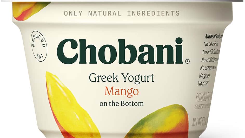
They launched new products like Less Sugar Greek Yogurt and Chobani Flip. Their packaging also got a makeover. Bright, colorful containers replaced the plain white cups with fruit pictures. The new design featured artwork from the 1800s in America. Chobani’s bold new look helped them stand out on crowded store shelves. It reinforced their new identity as a happy, healthy brand.
Candid
In some cases companies merge and require a fresh identity, which is called rebranding after a merger. One great example is Candid.
Foundation Center and GuideStar were two big organizations. The Foundation Center had much information about philanthropy worldwide, and GuideStar had data on nonprofits in the United States. In 2019, these two groups combined forces and became Candid.
By merging, they could provide better services to the millions who used their info. Candid created a fresh website design, a clear mission statement, and guiding principles. Their new vision united the strengths of both original organizations.
Rebranding as Candid allowed the merged company to have one cohesive brand identity. It positioned Candid as a major player in helping nonprofit groups, making the transition smooth for the millions relying on their resources.
Dropbox
Dropbox started in 2007 as a way to store and share files online. But over time, it grew into much more. In 2017, Dropbox changed its look to show this bigger purpose.
The old Dropbox logo was just a blue box – very literal. The new logo looked cleaner and simpler. It represented Dropbox as an “open platform” and “place for creation.”
This rebrand signaled that Dropbox had become more than just file storage. It could now help teams and businesses of all sizes work better together. Dropbox offers a full suite of collaboration tools.

By updating its brand, Dropbox positioned itself for continued growth. The new look showed that it was modern and relevant despite increasing competition.
The rebrand made sense as Dropbox transformed from a basic service into a comprehensive platform. Their new identity matched their expanded capabilities and vision.
Pet Food Experts
Pet Food Experts is a company that has been around for a really long time – since 1936! Over the years, they have changed their name and looked several times to stay current.
A big change happened when they changed their name from “Rumford Pet Center” to “Pet Food Experts.” This new name helped them stand out as a separate brand from Rumford Aquarium.
In 2008, Pet Food Experts got a new logo design. This updated look showed that the company had grown a lot. It was no longer just a small pet store—it had become a major supplier of pet products all across the country!
Pet Food Experts always seemed modern and relevant by regularly refreshing their brand name and visuals. Their changing identity matched their expanding business of offering more and more pet items over the decades.
Dunkin’ Donuts
Dunkin’ Donuts was a popular chain that sold coffee, donuts, and other baked goods. In January 2019, they made a big change – they dropped the word “Donuts” from their name! The company became just “Dunkin'”.
This rebrand showed that Dunkin’ wanted to focus more on its coffee drinks. The shorter name gave them a fresh, energetic vibe.
However, Dunkin’ kept some famous parts of its old branding. Its iconic pink and orange colors stayed the same. The font and other visual elements also remained so longtime customers would still recognize the brand.

By updating to just “Dunkin’,” the company modernized its image for a new era. But they didn’t lose the heritage and familiarity that made the brand so beloved in the first place.
The rebrand allowed Dunkin’ to highlight its popular coffee offerings with a simpler, trendier name. Yet, it paid respect to the donuts and history that fans loved.
IHOP
IHOP is a famous restaurant chain known for pancakes. In 2018, they did something clever with their branding. They announced they temporarily changed their name to “IHOb”—the International House of Burgers!
This weird name change caused a lot of buzz. Some customers liked the new “IHOb” name, while others didn’t want the pancake house to rebrand around burgers. There was a big discussion online and in the media about this rebrand.
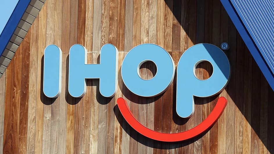
After getting lots of attention, IHOP admitted the whole “IHOb” thing was just a funny marketing trick. The fake rebrand was a way to promote IHOP’s new line of Angus beef burgers. Even though the name didn’t change, IHOP succeeded in getting people talking and interested in their new burger menu.
Airbnb
Airbnb began in 2008 as a website for people to rent out space in their homes to travelers. Over time it got much bigger. By 2014 it did a major rebrand to stay competitive.
The company updated its signature colors and font styles and introduced a new logo—the “Bélo.” This curvy symbol represents Airbnb’s mission in a fresh, modern way.
Before the rebrand, Airbnb was just seen as a place to book budget accommodations. Their new branding helped establish a stronger, more meaningful identity. It communicated that Airbnb was a community bringing people together through shared spaces and experiences.

The rebrand positioned Airbnb as more than just an online marketplace. It was a platform fostering real human connections between guests and hosts. The new visuals captured this unique social focus.
While straightforward, Airbnb’s rebrand was very effective. It aligned its brand identity with its evolved vision as a company. The modern look resonated with the cool, community-driven vibe Airbnb cultivated.
Instagram has long been a favored app for sharing photos and videos. However, its full potential wasn’t realized until a comprehensive brand like Facebook acquired it.
After Facebook acquired Instagram, they gave it a huge makeover. Instagram has a totally new logo and look. The app’s colors were updated to seem fresh and modern. Facebook also improved Instagram’s user experience by adding more features.
![]()
This rebranding helped transform Instagram’s image. It went from just another photo app to the top image-based social network. With a sleek new identity, Instagram could appeal to more users worldwide.
The successful rebrand allowed Instagram to capitalize on its growing popularity. People loved the bright new look and enhanced capabilities, so more and more people signed up and shared content on the rebranded platform.
The changes Facebook made gave Instagram a revitalized brand that fit its significance. The updated logo, color scheme, and features attracted a massive global audience.
KIA
KIA, known for manufacturing cars, underwent a rebranding in 2021 to highlight its renewed emphasis on electric vehicles.
KIA unveiled a brand new logo that looked like a handwritten signature. This made their brand seem fresh and modern. They also updated the entire design and look of their cars.
The new KIA vehicles had a sleek, appealing style with clean lines and curves. They looked very different from KIA’s older, boxier car models. The fresh designs matched KIA’s new vision for the future of transportation.
By rebranding, KIA communicated an important shift in its business. It wanted to be known as an innovative maker of electric, environmentally friendly cars and SUVs.
The new logo, cool designs, and overall rebrand helped position KIA at the forefront of the electric mobility movement. Their cars now looked cutting-edge, sustainable, and exciting.
This rebranding allowed KIA to reintroduce itself as a modern, eco-conscious brand for the electric era. Their cars’ transformation matched their brand’s bold new identity.
Victoria’s Secret
Victoria’s Secret, a company well-known for lingerie and cosmetics, has come under fire for its long-running marketing campaign that features slender supermodels referred to as “Angels.” There was criticism about this restricted focus on a single beauty standard since many felt it fostered unrealistic expectations that were out of reach for all women.
In 2021, Victoria’s Secret decided it was time for big changes. They wanted a brand image that was more modern and welcoming to all kinds of women. Instead of just super skinny “Angels,” they created the “VS Collective.”
The VS Collective brought together 10 women of diverse ages, body types, skin tones, and backgrounds. These women were meant to represent real beauty in all its forms.
The rebrand aimed to retire Victoria’s Secret’s old image, which promoted an unrealistic, one-size-fits-all standard of beauty. With the VS Collective, the brand wanted to celebrate women of all shapes, sizes, and walks of life.
This change showed Victoria’s Secret was listening to society. People wanted lingerie brands to stop making women feel inadequate if they didn’t fit one narrow ideal. The inclusive rebrand aligned Victoria’s Secret with these more positive values.
Bad Rebranding Examples
There are times when rebranding attempts might fail if they are not done with appropriate consideration. First, let’s look at a few examples:
Comcast
Comcast has long had a reputation for poor customer service in the U.S. It rebranded as “Xfinity” to improve its image with a new logo. However, changing its name and look didn’t fix the problem—its bad customer service practices. A successful rebrand needs changes that match the new brand, not just a surface makeover.
![]()
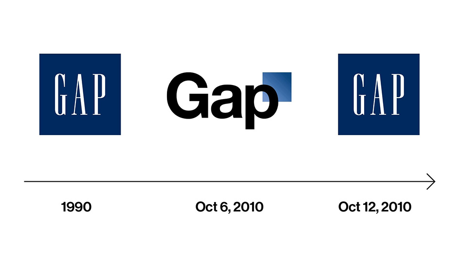
Gap
In 2010, the clothing company Gap changed its classic logo for no good reason. The new logo looked plain and didn’t represent the brand well. Customers loved the original Gap logo they were used to. After just six days, Gap had to return to its old logo due to the huge negative reaction from unhappy customers.
Weight Watchers
Weight Watchers tried rebranding to “WW” with a new focus on overall “wellness.” However, this confused many customers about whether their products and services would change along with the name. A rebrand should clarify a brand’s identity and offerings, not make things more confusing for customers.
![]()
These examples show that rebranding poorly – with no clear purpose, no real change, or losing touch with your core audience – can further damage a brand’s image and reputation.
conclusion
Rebranding is a powerful strategy that companies use to refresh their image and identity. There are many reasons why a business might rebrand. Products or services may have changed over the years, so the old branding no longer fits. Or a company wants to appeal to different types of customers than before. Sometimes an existing brand simply looks outdated and out-of-touch with the company’s current values and direction.
No matter the specific reason, rebranding gives a business the chance to start fresh. The examples we looked at show both successful and unsuccessful rebranding efforts. The most impactful rebrands thoughtfully realign the outward brand expression with the company’s inward purpose and customer value proposition.
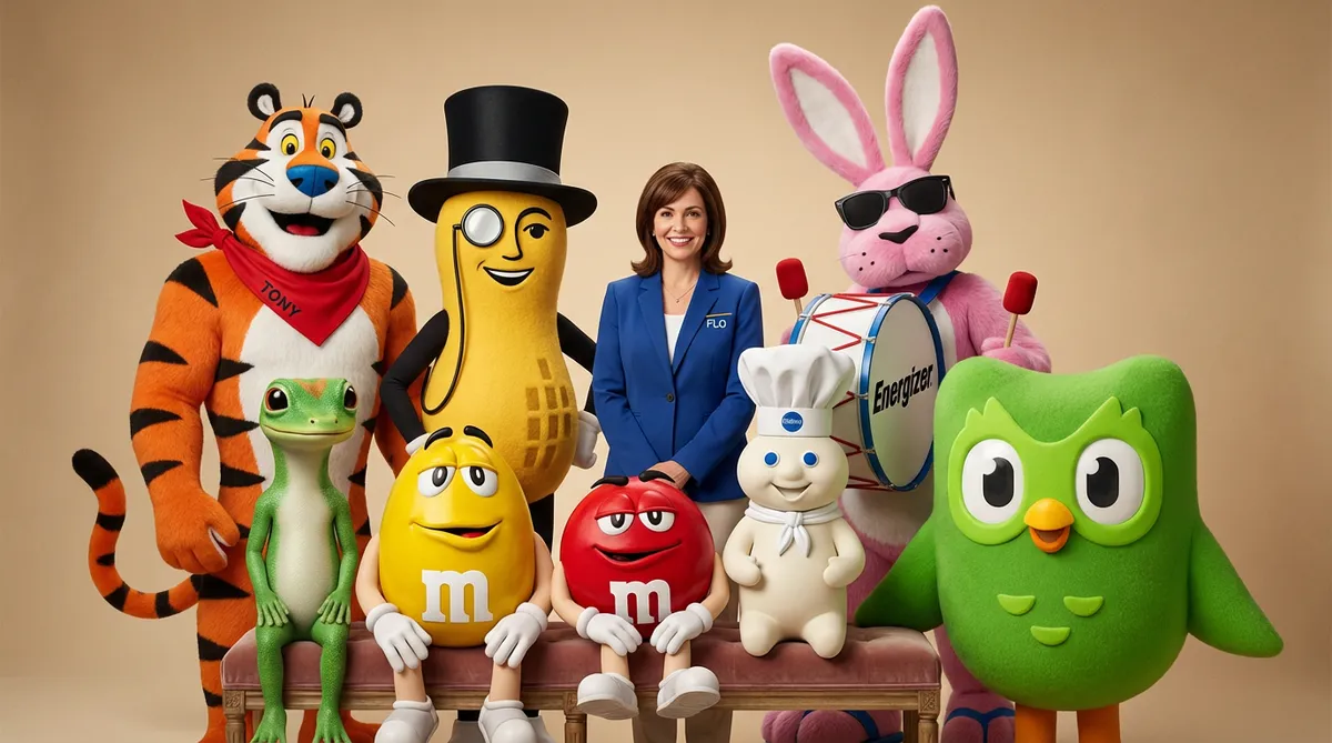
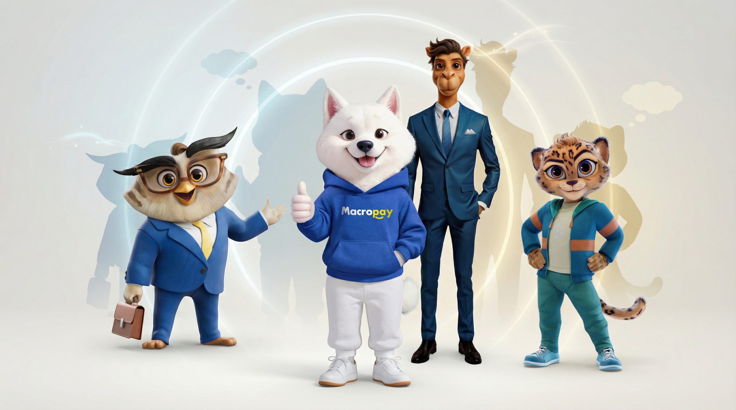
This positions the business for continued relevance in our ever-evolving world. Here at Dream Farm Agency, we offer services like Marketing strategy, brand design, mascot creation, digital marketing, creative content production, web3/metaverse development, and interactive brand experiences to help companies execute an authentic, holistic rebrand.
The most powerful rebrands don’t simply slap on a new logo. They realign the brand’s look and feel with its deeper identity in a cohesive way. This allows companies to remain modern and meaningful to their audiences.